prueba
Researching AI and UX where connectivity can’t be assumed.
This project explores how AI can support UX research and redesign work on Trazur Cursos, without replacing human judgment or real-user validation.
- Diagnosis
- Comparative research: heuristics + AI
- Findings & persona
- Prototyping & redesign proposal
- Validation with real users
This was my thesis project. I led the UX research, AI-assisted analysis, and design of the proposal, working alongside Renzo Morandi and under the guidance of Alejandra Capocasale — this case documents the full team’s work.
Scope: an academic project, validated through heuristics, AI, and prototyping — not yet with real users from the target audience. The percentages in this case are redesign targets, not measured results.
Uruguay leads the world in livestock traceability. Digital training keeps that standard running — but it doesn’t reach everyone equally.
Rural workers, the main audience for these courses, face low digital literacy, limited connectivity, and geographic and cultural barriers that make training hard to access.
Trazur Cursos runs into the same obstacles: complex navigation, inaccessible microcopy, and low course completion. That’s where this project starts: redesigning the learning experience for that context.

A platform designed for everyone ended up excluding the user who needed it most.
Trazur Cursos had confusing navigation, dense copy, weak visual feedback, and real friction at signup and checkout. For a rural producer with low digital literacy and an unstable connection, any one of those could mean dropping the course altogether.
The direction was clear from the diagnosis: simplify the information architecture, write accessible microcopy, surface clear navigation states, and add a contextual assistant — using AI to speed up analysis, always under human review (more in Method and Key Insights).
Understanding how AI can improve the UX of a rural e-learning platform for livestock traceability.
Specific goals
- Explore applications of AI in UX research.
- Evaluate AI tools for usability analysis.
- Propose an evidence-based, workable redesign.
Early signals (diagnosis)
- High bounce rate on course pages.
- A high share of incomplete signups.
- Deep scrolling and disorientation, visible in Clarity’s heatmaps.
- Friction in the checkout flow and difficulty understanding copy, based on exploratory Synthetic Users simulations.
Redesign targets
Impact goals set before the redesign — not measured results (see Expected Impact).
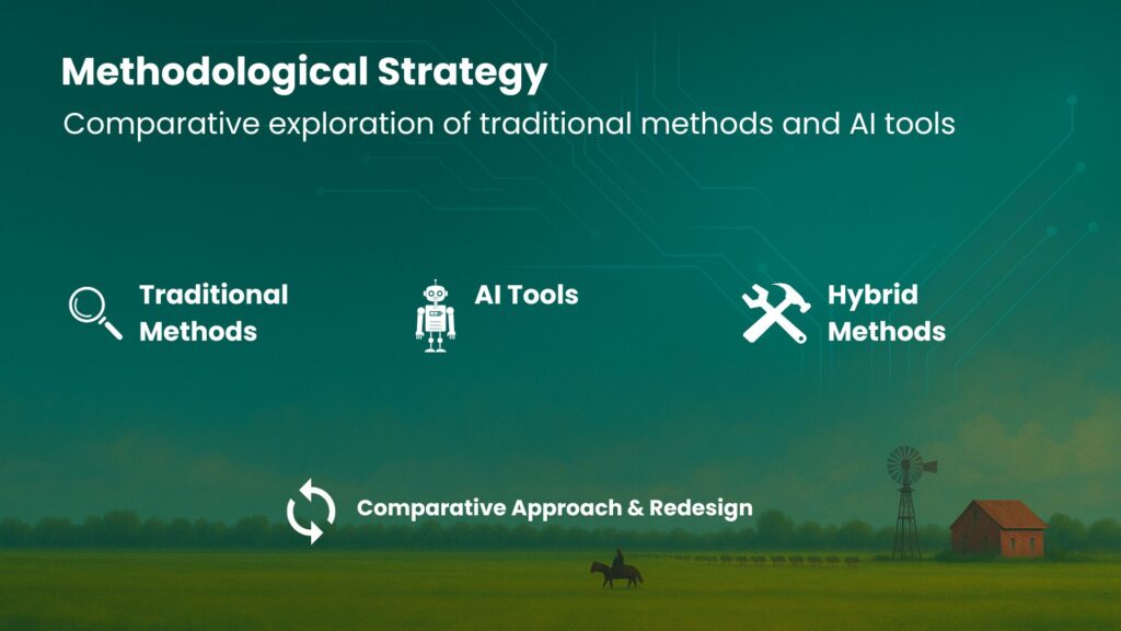
A comparative strategy: traditional methods and AI tools, always read together.
We compared traditional UX research methods with AI-assisted tools to assess the platform. Each approach surfaced a different kind of evidence.
Nielsen heuristics. Identified consistency, navigation, and feedback issues — the foundation of the initial diagnosis.
Google Analytics. Showed a high bounce rate and erratic clicks on course pages.
Microsoft Clarity. Heatmaps revealed deep scrolling and disorientation, especially on mobile.
Synthetic Users. An exploratory simulation: it generated hypotheses about checkout friction and comprehension issues — useful for prioritizing, not a substitute for real behavioral analytics or real-user testing.
Benchmarking. Compared against similar platforms, Trazur showed structural gaps in navigation and usability.
Can AI speed up a heuristic evaluation without losing depth?
To answer that, I compared a manual heuristic evaluation against the same exercise run through three AI models — ChatGPT, Gemini, and LLaMA 3 — looking at what each one caught, what it missed, and how deep the analysis went.
| Tool | Strengths | Issues found | Style & depth |
|---|---|---|---|
| Manual | Precise, realistic observations. Accounts for real user constraints. | Excessive copy, confusing navigation, feedback errors. | Thorough and empathetic, grounded in direct experience. |
| ChatGPT | Well-organized by topic. Highlights Nielsen’s heuristics. Suggests AI as assistance. | Misses real barriers. Limited contextual sensitivity. | Methodical and clear, but somewhat generic. |
| Gemini | Accessible language. Concrete suggestions and good practices. | Weak prioritization. Surface-level analysis, no clear examples. | Concise and approachable for non-experts. |
| LLaMA 3 (POE) | Solid breakdown by heuristic. Issues and solutions with current references. | Repetitive observations. Limited context. | Technical, direct, and modern, though less tailored. |
The manual review stayed the most accurate and context-sensitive, grounded in direct experience. The AI models sped up the process and organized findings well against known heuristics, but showed real limits: ChatGPT tended to miss real user barriers; Gemini’s analysis was more superficial; LLaMA was technical but repetitive and less tailored. The honest takeaway: AI speeds up the first pass — it doesn’t replace the judgment of the person doing the research.
Combining traditional methods and AI tools surfaced clear patterns of confusion and critical friction.
- Confusing, unintuitive navigation.
- Dense copy and inaccessible microcopy.
- Missing visual feedback — errors, loading, states.
- Excessive scrolling on mobile, causing disorientation.
- Friction at signup and checkout, leading to drop-off.
UX Evaluation: tools and findings
Six evidence sources, each with a different angle — read together, not in isolation.
-
Nielsen Heuristics
Consistency issues, confusing navigation and insufficient visual feedback.
-
Microsoft Clarity
Heatmaps and scroll-depth data revealed disorientation and a lack of focus.
-
Google Analytics
Quantitative data highlighted bounce behavior, erratic clicks and time spent on page.
-
Synthetic Users
Exploratory simulation: revealed difficulties in purchase flows and content comprehension, still to be validated with real users.
-
Benchmarking
Comparison with similar platforms exposed structural and usability gaps.
-
AI vs. manual analysis
AI supports and speeds up the analysis, but still requires interpretation and validation.
Turning insights into an archetype to prioritize the redesign.
Confusing navigation, dense copy, weak feedback, signup and checkout friction: from those insights, we synthesized an archetype persona, an end-to-end journey, and an ideal flow for the critical path — sign up, take the course, get certified. These artifacts guide the redesign and its priorities.

Juan Pablo Techera
Family livestock producer.
- Age: 53
- Gender: male
- Education: completed lower secondary school
- Digital literacy: low
- Location: Tacuarembó, Uruguay
- Primary device: mid-range Android phone, intermittent connection
Biography
Juan Pablo is 53 and lives in Rincón del Sauce, Tacuarembó. He runs a family livestock operation with his wife and son. He has hands-on knowledge of the land but little formal tech training. He gets online through his Android phone, with an unreliable connection. He’s self-taught, and values tools that let him keep learning without stepping away from his daily work.
Goals
- Meet traceability requirements without relying on others.
- Learn to log and check livestock data independently.
- Build the skills to pass this knowledge on to his son.
Frustrations
- Platforms that are slow or fail to load on a weak signal.
- Long copy with no practical examples.
- Signup steps that require outside help.
Interests
- Efficient livestock production within regulation.
- Technology applied to agriculture.
- Accessible training for rural workers.
I wish someone would walk me through it — this kind of thing, I get lost easily.
Juan Pablo Techera, family livestock producerPersona “Juan Pablo” — original work, thesis project, 2025.
Juan Pablo’s journey, from search to certification.
The map covers six stages, tracking Juan Pablo’s actions, thoughts, pain points, and opportunities at each one, from the first click to the downloaded certificate.
Most significant pain points
- During search: similar-sounding names and unclear search results.
- At signup: the form stalls registration, with no visible help in the moment.
- During the course: no clear progress indicator, and a dropped connection forces learners to repeat modules.
- At assessment: the certification process is confusing, with unclear steps to complete the course.
Every redesign decision responds to a concrete finding — not an aesthetic preference.
Confusing navigation
- Finding
- Heuristics and Google Analytics showed an unclear information architecture, with high bounce rates on course pages.
- Design decision
- Simplify the information architecture, with clear hierarchy starting from the homepage.
Inaccessible copy and microcopy
- Finding
- Heuristics and exploratory Synthetic Users simulations flagged copy that was too long and hard to understand for the target audience.
- Design decision
- Rewrite microcopy in plain language, with short signup steps.
Missing visual feedback
- Finding
- Loading, error, and progress states were unclear or missing entirely.
- Design decision
- Add explicit navigation states and a progress bar throughout the course.
Signup and checkout friction
- Finding
- Microsoft Clarity showed excessive scrolling and disorientation on mobile; the Synthetic Users simulation flagged possible checkout friction.
- Design decision
- Reduce signup to short steps, with a contextual assistant at the most critical points.
Three fidelity levels to test hypotheses before committing to a final visual direction.
-
Low fidelity (Balsamiq)Defined the core flows — signup, catalog, checkout — with no visual distractions.
-
Mid fidelity (Relume)Tested hierarchy, simplified navigation, and accessible microcopy.
-
High fidelityBrought together a visual design with a progress bar, clear completion states, and a contextual virtual assistant (chatbot) to resolve questions in real time.
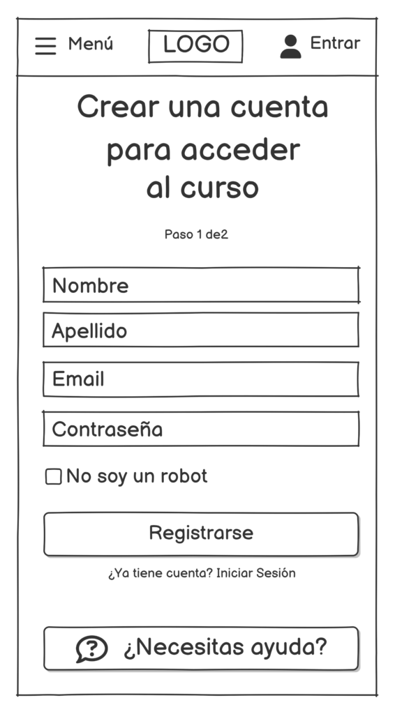
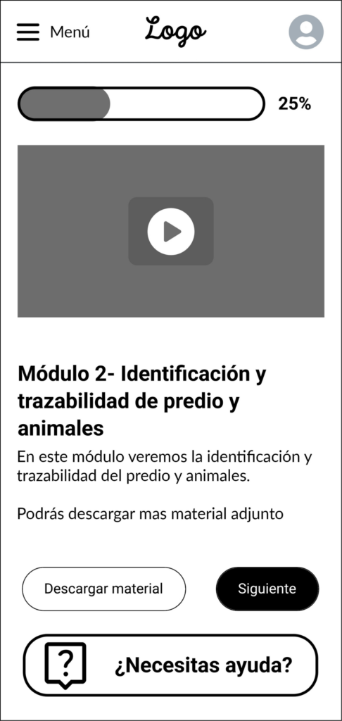
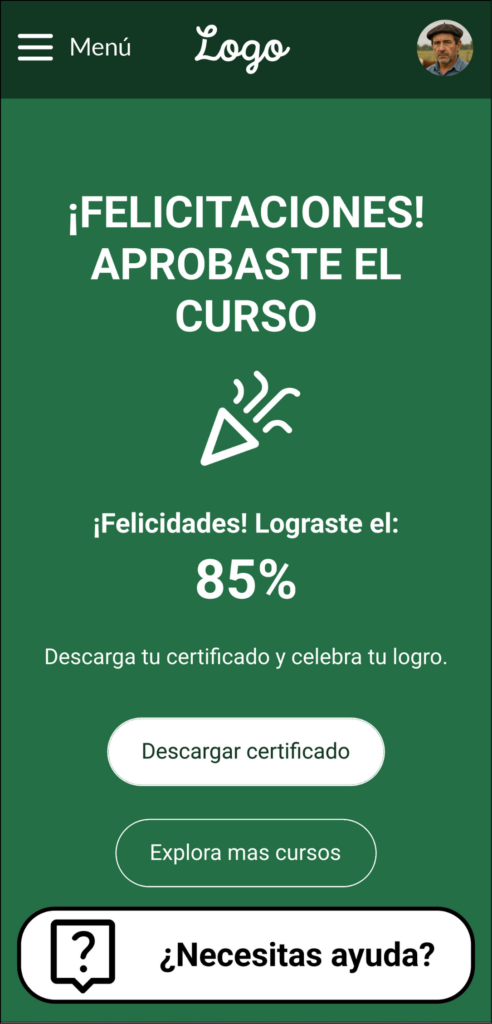
One unified flow, with short steps, visible feedback, and support at the critical points.
Each step in the flow responds to a specific finding from the sections above, and together they support the redesign targets.
- Homepage with direct access to courses and clear hierarchy.
- Course page with benefits, requirements, and a single CTA.
- Signup broken into short steps, with visible status.
- Clear checkout and purchase confirmation.
- Course progress bar with a contextual assistant for questions.
- Certificate accessible on completion.
Ideal user flow
-
Course catalog
Start -
- Pain point
- Unclear information architecture, with high bounce rates on course pages.
- Design decision
- Simplify the information architecture, with a clear hierarchy from the homepage.
- Evidence
- Heuristics (Nielsen) and Google Analytics.
-
- Pain point
- Long, hard-to-parse copy for the target audience.
- Design decision
- Rewrite the microcopy in plain language and leave a single call to action.
- Evidence
- Heuristics and exploratory simulation with Synthetic Users.
-
- Pain point
- Excessive scrolling and disorientation on mobile during signup.
- Design decision
- Break signup into short steps, with explicit navigation states.
- Evidence
- Microsoft Clarity — heatmaps and scroll depth.
-
- Design decision
- Signing up does not eject anyone from checkout: it is resolved along the way and the purchase resumes.
-
- AI intervention
- Contextual virtual assistant (chatbot) to resolve questions in real time.
- Design decision
- Place assistance at the critical points, not as a permanent global widget.
- Evidence
- Synthetic Users — possible friction in the purchase flow, still to validate with real users.
-
- Pain point
- Loading, error and progress states barely visible or missing.
- Design decision
- Explicit confirmation, with no ambiguity about transaction status.
-
- Design decision
- One place where a person sees their courses, their progress and their certificates.
- AI intervention
- The assistant stays available for questions about the account and progress.
-
- Pain point
- No visual feedback about progress inside the course.
- Design decision
- Add a progress bar during the course and clear advancement states.
- Evidence
- Heuristics (Nielsen) — visibility of system status.
-
- Design decision
- Clear course-passed states, defined in the high-fidelity prototype.
-
- Design decision
- The progress bar shows exactly which module is missing, so going back does not feel like a penalty.
-
- Design decision
- Close the loop with an explicit passed state before the certificate.
-
- Design decision
- Certificate available on the platform itself once the course is passed.
- Business value
- The ideal flow unifies the process on the platform: the journey closes inside the product.
-
End
Certificate downloaded
Intelligent virtual assistant available at key points.
Ideal flow — original work, thesis project, 2025.
A design hypothesis grounded in heuristics and prototyping — not yet validated with real users from the target audience (see Next Steps).
How this would be measured, not just what’s expected.
The quantitative targets are already defined in Goals & Expected KPIs. There’s no real data confirming them yet — the proposal hasn’t been deployed to production or tested with real users.
Measuring real impact means shipping the redesign and observing it in use: Google Analytics and Microsoft Clarity for bounce rate, signup time, and navigation behavior; course completion and certificate downloads as completed tasks; and usability testing with the target audience to validate comprehension and satisfaction. Without that cycle, these targets remain a design hypothesis, not a result.
What this project can’t claim yet.
- Synthetic Users is a hypothesis-generation tool, not a substitute for real behavioral analytics or testing with real people.
- Usability testing with real rural producers from the target audience hasn’t happened yet.
- The AI analysis showed limited contextual sensitivity: in some cases it missed real barriers or produced surface-level readings (see AI-Assisted Analysis).
- This is an academic project, not a production product — the redesign targets remain unmeasured (see Expected Impact).
Turning this redesign proposal into a validated, measured improvement.
Validate with real users
Usability testing with the target audience (remote and in-person), measuring key tasks: signing up, starting a course, and downloading the certificate. In parallel, field testing under limited connectivity and on mid/low-end devices.
Iterate on copy, components, and accessibility
Adjust copy and components based on real evidence — clarity of the single CTA, states, error messages — and run a WCAG AA accessibility checklist: contrast, tap target size, visible focus, keyboard navigation, and states.
Roll out incrementally, with instrumentation
Incremental production rollout with Google Analytics and Microsoft Clarity active — events, funnels, heatmaps — to compare against the baseline, and adjust image, video, and cache weight based on real performance under limited connectivity.
Pilot the contextual assistant
Pilot the assistant with FAQs and a glossary, tracking common questions to refine its prompts and boundaries.
Document the AI-in-UX-Research process
Develop a practical guide to applying AI in UX research — prompts, ethical guardrails, validation workflow — designed for teams with limited resources.
What I take away from this project.
Reflection
AI accelerates. It doesn’t replace.
This project was a deep exercise in research and design. AI strengthened the analysis, prioritization, and copy variants — but human judgment stayed essential for accessibility, context, and final decisions.
- A hybrid method means depth and speed. Combining heuristics and analytics with AI improved turnaround without losing interpretation or design empathy.
- The real challenge isn’t designing with AI — it’s designing for real people: people navigating on an unstable signal, using a basic phone, learning while working the land.
- Measure and learn in short cycles: instrument KPIs, launch small, observe real behavior, and iterate.
The complete visual summary of the thesis project.
Heuristics, method, prototypes, and conclusions, in one poster.