REstimator Design System
The design system behind Presupuestador RE, a B2B quoting tool for metalwork and ironwork shops. Dark, industrial, dense, desktop-first, with a single rationed amber accent. This documentation gathers its foundations, its components, its product patterns and its responsive system.
Overview
Presupuestador RE helps estimators and shop owners produce faster, more consistent quotes from standardised criteria: families → subcategories → dimensions, calibrated price ranges, labour days and material references. It is a tool for daily work.
What the system is for
To codify that product as reusable foundations, components and screen recreations, so any new surface is built on-brand in minutes. The frozen V1 mid-fi prototype is the reference: the information architecture, the flows and the screen structure are already settled. The system raises visual quality only; it does not redesign flows or change the IA.
Principles
Overall architecture
| Layer | Location | What it holds |
|---|---|---|
| Global entry point | styles.css | An @import manifest only. Consumers link this file. |
| Tokens | tokens/ | fonts · colors · typography · spacing · elevation · theme-light · base |
| Components | components/ | React, 6 categories. Namespace window.PresupuestadorREDesignSystem_84f335 |
| Foundation cards | guidelines/ | 16 specimens of colour, type, space, brand and theme validation. |
| UI kit | ui_kits/presupuestador/ | 5 interactive hi-fi screens of the frozen product, dark. Token-driven via kit.css + shell.js |
| Mobile spec | Mobile v1 - Spec de implementación.html | 3 final mobile screens with measurements, spacing, sticky behaviour and components. |
| Agent skill | SKILL.md | Makes the folder usable as an Agent Skill in Claude Code. |
Status and versioning
Frozen
- IA, flows and screen structure (V1).
- Type pairing (2026‑06‑16) — not to be re-explored.
- The 5 product rules (below).
Stable and in use
- 147 tokens · dark theme.
- 33 exported components.
- 5 desktop screens from the kit.
Specified, not built
- 6 mobile components (Mobile v1).
- Tablet layer (documented, no artifact).
- templates/ — 0 templates.
Non-negotiable product rules
They come from S12 and are respected on every new surface. They are rules of the business domain, not design criteria.
Foundations
147 tokensEvery value in this section is a real system token, read from tokens/. Components always read var(--re-*), so nothing hardcodes a value.
Colour · graphite ramp (dark base)
Charcoal — deeper panels
Amber — the only brand colour
Amber rationing rule. Amber appears in exactly four kinds of moment: the recommended price (amber figure on the deepest charcoal), the active navigation rail, the primary / submit CTA and the logo. Everything else is resolved with graphite and hairlines. See NR‑08 for how this rule extends to mobile.
Semantic (tuned for dark)
Quote lifecycle (History)
Semantic aliases — prefer these in components and screens
| Alias | Resolves to | Alias | Resolves to |
|---|---|---|---|
| --re-bg | --re-canvas | --re-border | --re-line |
| --re-text | --re-ink | --re-border-field | --re-line-2 |
| --re-text-muted | --re-ink-2 | --re-border-strong | --re-line-strong |
| --re-text-subtle | --re-ink-3 | --re-focus | --re-amber |
| --re-text-faint | --re-ink-4 | --re-accent / --re-primary | --re-amber |
| --re-accent-hover | --re-amber-strong | --re-primary-hover | --re-amber-strong |
Light theme — planned
Planned The published system has a single theme: dark. A colour remap has been explored —warm white surfaces, graphite ink, warm grey borders— which would leave spacing, typography, radii, hierarchy and interaction untouched, with amber as the only accent. It is not part of the system yet and is not documented as available.
Typography · FROZEN
The pairing is final and is not re-explored. An alternative with Plus Jakarta Sans was evaluated against the real screens (Typography Comparison.html) and rejected: Hanken won on density, legibility at small sizes and industrial tone.
Primary UI — Hanken Grotesk
Technical — JetBrains Mono
PRE-2026-0148
Actual scale
| Token | Value | Use | Sample |
|---|---|---|---|
| --re-text-display | 40px | The hero “recommended” figure | $135.599 |
| --re-text-2xl | 23px | Page H1 | Calculator |
| --re-text-xl | 21px | Compact H1 | History |
| --re-text-lg | 17px | Section H2 | Dimensions |
| --re-text-md | 14.5px | Card titles | Quote header |
| --re-text-base | 14px | Body / controls | Tread width |
| --re-text-sm | 13px | Secondary body, cells | Pedro Núñez · Railings |
| --re-text-xs | 12px | Hints, captions | decimals with a comma |
| --re-text-2xs | 11px | Eyebrows, uppercase labels | ESTIMATED FABRICATION |
Weights · line-heights · tracking · helpers
- Regular
- 400
- Medium
- 500
- Semibold
- 600
- Bold
- 700
- tight
- 1.15
- snug
- 1.35
- normal
- 1.45
- relaxed
- 1.6
- ls-body
- -0.005em
- ls-heading
- -0.02em
- ls-tight
- -0.01em
- ls-eyebrow
- 0.06em
- ls-caps
- 0.05em
| Class | What it does |
|---|---|
| .re-root | Base document type: family, 14px, lh 1.45, tracking, colour, antialiasing, font-feature-settings:"tnum" 1,"ss01" 1. Opt-in on <body> or a wrapper. |
| .re-num | Tabular figures — money, measurements, codes, dates. |
| .re-mono | Switches to JetBrains Mono. |
| .re-eyebrow | Eyebrow / kicker: 11px, 600, +0.06em, uppercase, faint colour. |
Numbers and units — Uruguayan format, always tabular
| Type | Format | Example |
|---|---|---|
| Money | dot as thousands separator, no decimals | $168.000 |
| Measurements | decimal comma + unit | 0,80 m · 2,90 m |
| Labour days | decimal comma, one decimal place | 7,0 |
| Percentages | sign + value | + 8% · IVA 22% |
| Codes | mono, uppercase | GV-A-00148 · ESC-RECT |
Spacing · 4px grid
Sizing · layout constants (from the frozen V1 shell)
- Sidebar
- 248px
- Topbar
- 60px
- Document width
- 1080px
- Standard control
- 40px
- Compact control
- 32px
Radius
Borders
Structure is drawn with 1px lines, not heavy fills. Hairlines everywhere: --re-line for dividers and card borders, --re-line-2 on inputs, --re-line-strong for emphasis and dashed rules.
Elevation
In dark, depth is a lighter surface plus a 1px border; shadows sit deep and quiet underneath. No glow, no coloured shadow.
Iconography
Rules
- Inline line SVG only. viewBox 24×24, stroke="currentColor", stroke-width ~1.7–1.8 (1.7 for nav/UI, 2 for chevrons/arrows), round caps and joins.
- They inherit text colour and sit at 15–18px.
- No icon font, no sprite, no PNG, no emoji, no unicode pictograms. A “✓” in transient toasts is the only exception.
- For new surfaces, copy the shapes from the kit before reaching for a library. There is no bundled CDN set: the set is small and hand-maintained.
Recurring glyphs
Product taxonomy family — TaxonomyIcon
10 fabrication-category glyphs drawn in the same language (24×24, stroke 1.7, no fills, no external library): stairs · railings · grilles · enclosures · doors · gates · furniture · structures · roofs · grills. They are used in category rails, dropdowns, catalogue cards and chips, so the product reads as a specialised metalwork tool and not as a generic business app. API: <TaxonomyIcon name="rejas" size={18} strokeWidth={1.7}/>; iterate TAXONOMY_ICONS for menus; colour via currentColor (amber when active).
Motion
Minimal and functional. .12–.15s ease on hover / border / background; toggles slide their knob; the only ambient movement is the slow pulse of the “Live” dot in live panels. No bounces, no parallax, no entrance choreography, no scale effects.
Breakpoints
| Layer | Reference width | Role |
|---|---|---|
| Desktop | ≥ 1200 · design 1440 | Primary layer. Fixed sidebar + side result panel. |
| Tablet | 834 | Intermediate layer with an identity of its own: top tabs + bottom sheet. |
| Mobile | 390 · fluido 360–430 | Designed, not adapted. Bottom tab bar + pinned summary. |
Breakpoints are not tokenised: they live in prose and in the specs, not in tokens/. Any implementation is hardcoding them.
Accessibility foundations
| Decision | Value | Why |
|---|---|---|
| Contrast of faint labels | --re-ink-4 #7f858e | Raised from #686d76 (≈3.4:1) to clear WCAG AA 4.5:1 on surfaces. |
| Visible focus | --re-ring 3px amber | A 3px ring + amber border on every focusable control. The outline is never removed without a replacement. |
| Touch targets | ≥ 44px | Minimum touch size on mobile/tablet; 42px visual controls carry an extended hit area. |
| Icons without text | title obligatorio | IconButton requires title, used both as tooltip and aria-label. |
| Figures | tabular-nums | Money and measurements never “dance” between states; vertical comparison stays reliable. |
| State never by colour alone | dot + label | The lifecycle uses a coloured dot and a written label. |
Components
33 exports · 6 categoriesThe 33 components exported by window.PresupuestadorREDesignSystem_84f335. Each directory holds <Name>.jsx + .d.ts + .prompt.md and a *.card.html specimen. The specimens below are token-driven replicas of the real components (same tokens, same anatomy), so this document does not depend on a React runtime.
How to read the subcomponents. Several exports live in one parent file: Field/Input/Select/Textarea ← forms/Input.jsx · Card/CardHead/CardBody/SectionHead ← layout/Card.jsx · AppShell/LogoMark/Sidebar/NavGroup/NavItem/Topbar/Breadcrumbs/UserChip ← navigation/AppShell.jsx · Table/TableToolbar/RowActions/Pagination ← data/Table.jsx · Badge/StatusBadge and Alert/AlertGroup ← their own feedback/ files.
Button
Purpose
The main action control. Exactly one primary (or accent) per view; everything else is secondary or ghost.
API
- variant
- secondary | primary | accent | ghost
- size
- sm | md | lg
- block
- boolean
- iconLeft / iconRight
- ReactNode (16px)
Variant semantics
- secondary — neutral outline, the workhorse.
- primary — solid charcoal fill, the screen's single main action.
- accent — brand amber fill, reserved for hero send/share actions.
- ghost — no border, low-emphasis inline actions.
Tokens
IconButton · Toggle · SegmentedControl
- variant
- default 34 | bare 30
- danger
- boolean
- title
- required
Icon-only, for the topbar and row actions. title is used both as tooltip and aria-label.
- pressed / defaultPressed
- boolean
- size
- md | sm
- accent
- boolean
- disabled
- boolean
- options
- 2–3 items
- value
- string
- onChange
- (value) => void
More than 3 options → use Select.
Field · Input · Select · Textarea
API
| Export | Relevant props |
|---|---|
| Field | label · optional · note · htmlFor |
| Input | prefix · suffix · leadIcon · num |
| Select | children (<option>) · chevron propio |
| Textarea | nativo · resize vertical |
Behaviour
- Field wraps: label + inline hint (“optional”) + control + note with icon.
- num switches on tabular figures and alignment for money and measurements.
- prefix/suffix for $ and units (m, %).
- Focus: amber border + --re-ring. Disabled: opacity .45.
There is no error/invalid prop on Field or Input. The product's validation is warn-only via Alert, so field-level inline errors are undefined in the system.
Badge · StatusBadge
API
- Badge · tone
- neutral | ok | warn | crit | info
- Badge · dot
- boolean
- Badge · square
- mono code chip
- Badge · icon
- ReactNode
- StatusBadge · status
- draft | sent | appr | rej | cancel
- StatusBadge · label
- overrides the default label
Usage
- StatusBadge maps dot colour + written label automatically. Do not assemble the pill by hand.
- square for codes (GV-A-00148, ESC-RECT): mono, 5px radius.
- State is never communicated by colour alone: always dot + text.
Alert · AlertGroup
API
- Alert · tone
- warn | ok | info | crit | neutral
- Alert · icon
- ReactNode · null hides it
- Alert · title
- bold lead line
- AlertGroup · title
- “Alerts and reminders”
- AlertGroup · items
- ReactNode[]
Behaviour
- The engine is warn-only and never blocks; that is why warn is the default tone and the triangle is the default icon.
- AlertGroup is the titled reminders panel with bullets.
- Microcopy: info/lock icon + a single sentence.
Tokens
Card · CardHead · CardBody · SectionHead
This card is the specimen: CardHead (icon tile + title + hint + actions) over a divider, then CardBody.
API
| Export | Props |
|---|---|
| Card | pad (20/24 interno) · flush (clip para tablas) |
| CardHead | icon · title · hint · actions |
| CardBody | tight (menos padding para tablas/listas) |
| SectionHead | index · title · hint · tools |
Anatomy
Graphite surface, 1px --re-line border, --re-shadow-sm, --re-r-lg 13px radius. flush when the card wraps a full-bleed table.
Do / Don't
- Do — use a numbered SectionHead for the steps of a long flow (calculator, editor).
- Don't — nest cards inside cards; to group content within a card use SectionHead + dividers.
StatTile
API
- label
- uppercase
- value
- tabular
- sub
- supporting line
- accent
- charcoal variant
- dot
- live status dot
- amberValue
- figure in amber
Usage
- Dashboard KPI row and status grids.
- accent is for one single highlighted tile per row: it is the charcoal anchor.
- amberValue sparingly: headline figures only (it respects amber rationing).
- dot combines with accent for “Live” panels.
TechnicalPreviewCard · TechnicalRenderers
The only sanctioned drawing in the system: schematic plans and elevations generated parametrically from the quote’s own dimensions. They are measured diagrams, with 1px graphite structure lines, token-driven dimension overlays and amber reserved for the entry/railing cue.
Registry
Registry-based: family/variant select a renderer. Stairs ships four: straight (side elevation), L, U and spiral (plan views). Unknown families fall back to a “no technical view” placeholder.
Permitted use
- Calculator and editor previews, history rows, the client-facing document.
- Never hand-draw decorative product art.
API
- family
- Stairs | others → placeholder
- variant
- straight | L | U | spiral
- dims
- width · height · run · steps · tread · riser · diameter
- config
- string[] of chips
- size
- compact | standard | large
- title / code
- override · mono code
- showDims
- default true
- live
- “Live” indicator
Densities
- compact — head + drawing + footer.
- standard — + 4 dimensions + chips.
- large — bigger stage + 6 dimensions.
Extending
TechnicalRenderers.register(family, variant, def) · setFamilyLabel · has · variants · families, all chainable. escalones is clamped to 4–16; a chip matching /baranda|pasamano/ draws the railing on recta.
Navigation & App Shell
The desktop shell is the primary layer and has been frozen since V1: a 248px sticky sidebar + a 60px sticky topbar + a scrolling main. Mobile does not compress that shell: it changes pattern.
Desktop — AppShell
Topbar · Breadcrumbs · UserChip
API
| Export | Props |
|---|---|
| AppShell | sidebar · topbar · children |
| LogoMark | mark ("RE") · name · tagline |
| Sidebar | logo · footer · children |
| NavGroup | label · first |
| NavItem | icon · label · active · as |
| Topbar | breadcrumbs · actions |
| Breadcrumbs | items: {label, href}[] |
| UserChip | name · role · initials |
LogoMark has the default tagline 'RE · v1.0', but the kit screens and the mockups show “REstimator · motor v1.5”. The default needs to be unified, or passed explicitly every time.
Mobile — bottom navigation + compact header
Mobile is designed, not adapted: the sidebar is not “hidden”, it is replaced by a bottom tab bar of 5 families. Breadcrumbs disappear (title + back replace them) and branding appears only once per header.
| Element | Size | Behaviour | Status in the DS |
|---|---|---|---|
| BottomTabBar | h 64 + safe-area | fixed bottom. 5 tabs: Home · Calc · History · Catalogues · Params. Icons 21, label 10. Active --re-amber-ink. | New |
| MobileHeader | h ~62 | sticky top. Back + title (Calculator) or brand + title (Home / History). No breadcrumbs, no sub-copy. | New |
| BottomActionBar | h 62 · bottom 64 | fixed above the tab bar. Calculator only: Save (primary) · Estimate · Quote. | New |
| AppShell (mobile mode) | — | Same route tree, three navigation modes (sidebar / tabs / bottom bar). | Extended |
Sticky / fixed behaviour
| Layer (bottom to top) | Height | Position | z-index | Where |
|---|---|---|---|---|
| Bottom tab bar | 64 | fixed bottom 0 | 40 | Mobile |
| Action bar | 62 | fixed bottom 64 | 35 | Mobile · Calculator |
| Compact header | ~62 | sticky top 0 | 30 | Mobile |
| Recommended summary | auto ~108 | sticky bajo header | 28 | Mobile · Calculator |
| Bottom sheet (breakdown) | max 78% | overlay + scrim | 60 | Mobile · Tablet |
| Sidebar / Topbar | 248 / 60 | sticky | — | Desktop |
| Result panel | 380 col | sticky lateral | — | Desktop · Calculator |
| Save bar | auto | fixed bottom · shadow-bar | — | Desktop · Editor / Parameters |
Forms & Data Entry
Forms are the heart of the product: the calculator is a long form with a live result. Data entry favours typing speed and tabular reading over ornament.
Control inventory
| Control | Export | Variants / sizes | Defined states |
|---|---|---|---|
| Text input | Input | prefix · suffix · leadIcon · num | default · focus · disabled · placeholder |
| Select | Select | native + custom chevron | default · focus · disabled |
| Textarea | Textarea | vertical resize | default · focus · disabled |
| Search | Input + leadIcon | a pattern, not a separate component | default · focus · with a value |
| Toggle | Toggle | md 38 · sm 32 · accent | on · off · disabled |
| Segmented | SegmentedControl | 2–3 options, with or without icon | selected · unselected |
| Field wrapper | Field | label · optional · note | — |
| Checkbox · Radio | — | They do not exist as components. The product resolves choice with Select, SegmentedControl and Toggle. See NR‑13. | |
Control states
Hover · focus · pressed · disabled — global rules
| State | Treatment |
|---|---|
| Hover | fill to --re-surface-2 + border to --re-line-strong (or amber-darken on amber CTAs) |
| Focus | 3px amber ring (--re-ring) + amber border |
| Pressed / active | toggles and active pages flip to amber |
| Disabled | opacity .45, no events |
| Transition | .12–.15s ease on background / border. No shrink, no scale. |
Validation · errors · success
The calculation engine is warn-only and never blocks. That product decision defines all validation: warnings are grouped as an Alert next to the result, not as field errors that stop you from moving on.
Data entry pattern — long forms
- Numbered steps with SectionHead: Product → Dimensions → Construction options → Finish / installation / zone.
- One card per step; a 2–3 column grid on desktop, 1–2 on tablet, 1 on mobile.
- Units always visible as a suffix, never only in the label.
- Decimal comma on measurements — the step hint is a reminder (“decimals with a comma”).
- Live recalculation: there is no “calculate” button; the result panel shows the “Live” dot.
- Optional fields marked with an inline optional hint, rather than an asterisk on the required ones.
Save bar
The Editor and Parameters screens use a fixed bottom bar with a change count (“1 local calibration change”) + Restore defaults + Save changes. Shadow cast upwards (--re-shadow-bar).
Data Display
History is the main data surface: a dense table, filters that work, state as a coloured dot on a neutral pill, and row actions revealed on hover.
Table · TableToolbar · RowActions · Pagination
API
| Export | Props |
|---|---|
| Table | children (thead/tbody propios) |
| TableToolbar | title · count · actions |
| RowActions | children (IconButtons) |
| Pagination | showing · pages · current · onPage |
Helpers
- Header classes: is-right · is-center · is-sortable.
- Cell classes: re-cell-strong (primary) · re-cell-sub (secondary line).
- Wrap in <Card flush>: the card clips the table’s overflow.
- RowActions is revealed on row hover.
Amounts and figures
- The amount column is right-aligned, tabular-nums, weight 600.
- Code in mono at 11.5px, colour --re-ink-3.
- Two-line row: primary (re-cell-strong) + secondary client · date.
Empty state — the product's real pattern
Empty states explain the rule, they do not just say “no results”.
There is no loading / skeleton component in the system, and empty states exist only as copy inside screens, not as a reusable component.
Cards, tiles and badges as display
Already documented in §02: the Card family for containers, StatTile for KPIs and status grids, Badge/StatusBadge for labels, codes and lifecycle, TechnicalPreviewCard for the product's schematic drawing.
Product Patterns
Patterns specific to REstimator. They are not components: they are compositions with business meaning, and several are governed by the non-negotiable rules in §00.
Recommended value and ranges
Pattern rules
- The recommended value is the only amber figure on the screen and sits on the deepest charcoal.
- It is always shown with its range (min / max) and a pin on the track: the number never appears alone.
- The price comes from calibrated Fab_min/Fab_max, not from labour days × rate.
- Always labelled “fabrication value · + VAT”: it is never implied to be a final price.
- The panel carries the “Live” dot: continuous recalculation, no calculate button.
Labour days — a control, not a price
Result steps
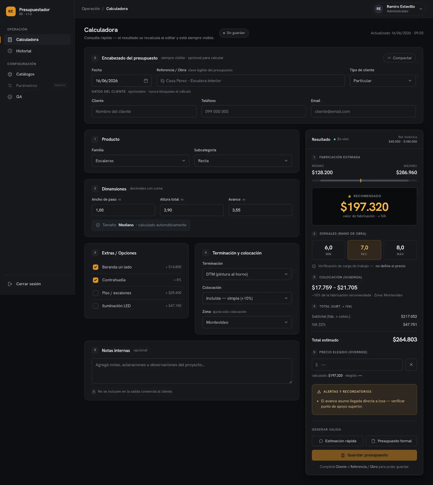
The result panel always presents the same numbered steps, in the same order, across all three breakpoints:
| Step | Block | What it communicates |
|---|---|---|
| 1 | Estimated fabrication | Min–max range + track with the recommended pin. |
| — | Recommended | Charcoal block with the amber figure. The visual anchor. |
| 2 | Labour days · workforce | Min / Rec. / Max as a workload check. |
| 3 | Installation (suggested) | Range + calculation basis (~10% of fabrication) + zone. |
| 4 | Subtotal | Fabrication + installation → subtotal, with an explicit “+ VAT”. |
| 5 | Override | Manual adjustment of the final price, always visible as a separate field. |
| 6 | Alerts | A warn-only AlertGroup at the foot of the panel. |
Creating and editing quotes
Calculator flow
- 1 Product — family → subcategory (10-category taxonomy).
- 2 Dimensions — measurements in metres, decimal comma.
- 3 Construction options — structure, riser, anti-slip, railing.
- 4 Finish · installation · zone — DTM, installation type, geographic zone.
- The quote header is optional and collapsible: it does not steal focus from the form.
Classification
Families → subcategories is the backbone. TaxonomyIcon accompanies each category in rails, dropdowns, catalogue cards and chips.
Lifecycle and actions
- States: Draft → Sent → Approved / Rejected / Cancelled.
- No hard deletes: the state change is soft and reversible.
- Duplicate is first-class: picking up a previous quote is the most common path.
- Freeze: on publication, the quote freezes its version of the parameters and becomes immutable.
- Override: the manual adjustment is recorded; it does not silently replace the recommended value.
Filters and search
- Search by number, client or project in a single input with a leadIcon.
- Type/state filters on one line; on mobile they scroll horizontally, with a solid amber active state.
- The result count is always visible (“58 results”).
The client-facing document — the only light surface
The client summary is rendered as a real sheet of white paper (it is the printable / WhatsApp / PDF artifact) resting on the dark workbench; its total row is charcoal with the total in amber. Everything else in the product is dark. Estimate and formal modes via SegmentedControl. Formal third-person voice (“Please find attached an estimate…”), never informal address. It never serialises ranges, labour days, margins or calibration (rule 5).
Voice and microcopy
| Rule | Application |
|---|---|
| Language | Uruguayan Spanish, Rioplatense voseo in the imperative: “Agregá notas…”, “buscá, filtrá y retomá”. Never “añade/busca”. |
| Tone | Plain, operational, trustworthy. Short declaratives. It explains why a number exists without hedging. |
| Casing | Sentence case for everything readable. UPPERCASE + tracking only on small eyebrows. |
| Person | The app speaks to you (the estimator). The client-facing document is formal and third-person. |
| Emoji | Never. A “✓” in transient confirmations is the only decorative character. |
| Help notes | Info/lock icon + a single sentence. |
Responsive System
The same system at three densities. Mobile is not another product: same tokens, same taxonomy, same result steps and same vocabulary, with the navigation and result pattern that suits the available space.
Transformation by aspect
| Aspect | Mobile · 390 | Tablet · 834 | Desktop · 1440 |
|---|---|---|---|
| Navigation | Bottom tab bar (5 families) + contextual title | Top family tabs under the header | Fixed 248px left sidebar |
| Branding | RE monogram in the header (avatar = user, not brand) | Compact monogram + name | Logo + name + engine version in the sidebar |
| Breadcrumbs | Hidden — replaced by title + back | Compact, optional | Complete, in the topbar |
| Header | Compact sticky: back + title; no sub-copy | Sticky: title + action | Topbar + page head |
| Result | Pinned summary on top + sheet on demand | Collapsible bottom sheet with a peek | 380px sticky side panel |
| Primary actions | Fixed bar above the tab bar | In the sheet's peek + inside the panel | Inside the result panel |
| Sticky | Header + summary + action bar | Header + sheet peek | Result panel + save bar |
| Forms | 1 field per row; numbered sections with anchors | 2-column grid with breathing room | 2–3 column grid |
| Density | Stacked cards, gap 14, padding 16 | Intermediate, padding 22 | Dense, padding 20/24, gap 16–20 |
| Tables / lists | Row = card; tap opens it; secondary actions in ⋯ | Reduced table or cards depending on width | Full table + RowActions on hover |
| Control | 42px | 42px | 40px (--re-control-h) |
Result pattern — a decision per breakpoint
Four options were evaluated (sticky side · summarised top · bottom sheet · hybrid) and the hybrid composition was chosen: no single option wins at all three sizes, so the pattern adapts to the space. The recommended value stays glanceable at all times; the breakdown is one tap away.
Desktop ≥ 1200
Horizontal space to spare: the full breakdown stays sticky beside the form, as it already worked.
Tablet 834
Form at a comfortable width; a bottom peek bar with the recommended value + range + CTA. It expands without covering fields.
Mobile 390
Pinned result header (recommended + range + size); “View breakdown” opens the sheet. Actions live in a fixed bar.
Mobile v1 constants
- Base viewport
- 390 × 844
- Fluid range
- 360–430
- Grid
- 4px (--re-s*)
- Screen padding
- 16 (s4)
- Gap between cards
- 14
- Card
- r13 · pad 16
- Control
- h42 · r7
- Touch target
- ≥ 44
- Safe area
- env(safe-area-inset-bottom)
Component adaptation rules
- Nothing is merely “hidden”. If an element does not fit, it is replaced by its touch equivalent.
- One dominant action per tap: the whole row opens; secondary actions move to a ⋯ overflow.
- Chips on one line with horizontal scroll; the active one is solid amber, never wrapping to two lines.
- No sub-copy in touch headers: title + back and nothing else.
- One brand mark per header: monogram = app, avatar = user.
- The bottom sheet carries only the breakdown: it never becomes navigation.
Full spec: Mobile v1 — Implementation spec
The tablet layer is documented and specified, but there is no tablet screen artifact in ui_kits/. The tablet values come from the refinement mockups, not from a screen in the kit.
Screen Examples
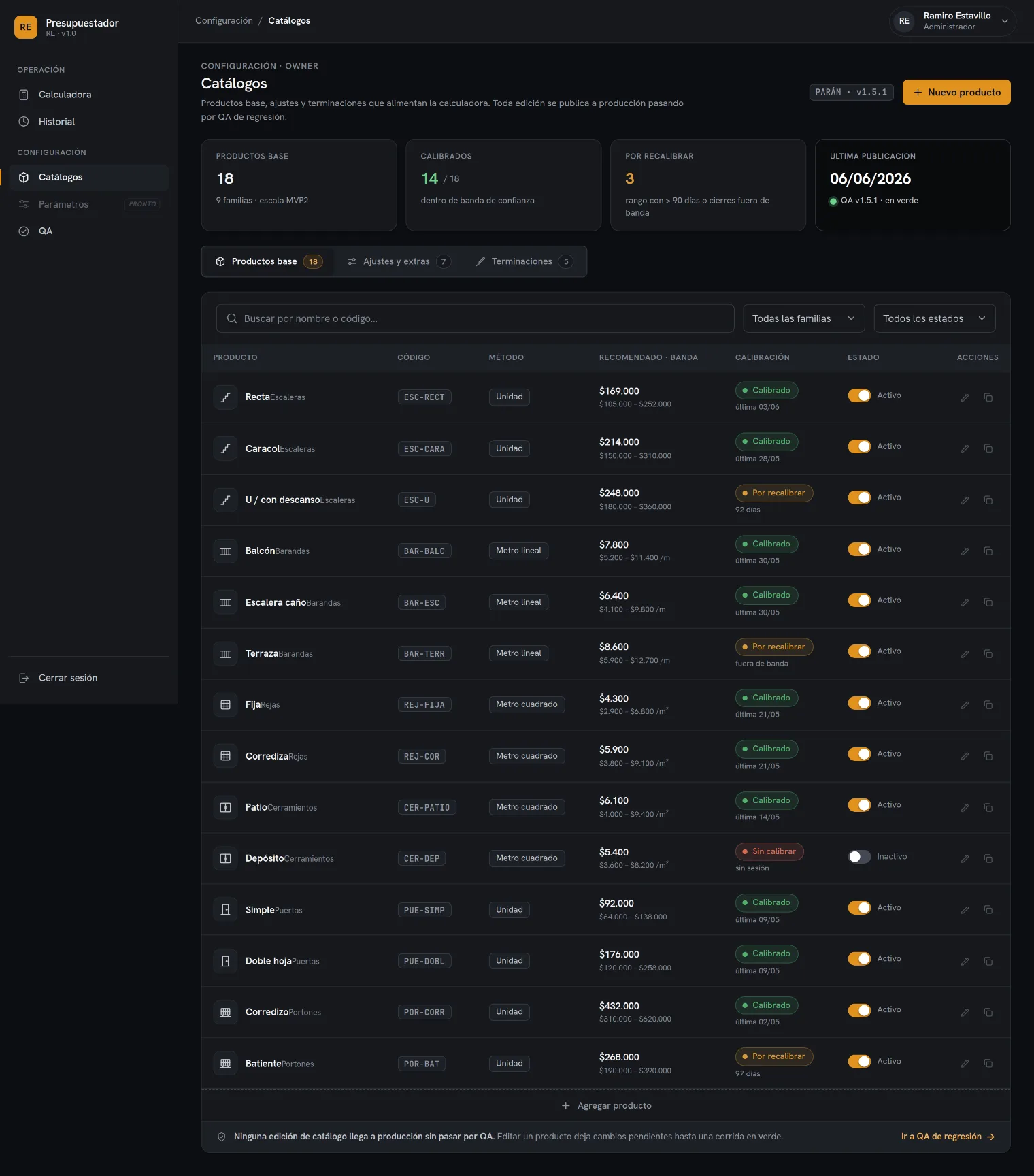
5 desktop · 3 mobileThe product screens built with the system. The five desktop ones come from the UI kit; the three mobile ones come from the Mobile v1 implementation spec. Each is captured at high resolution and can be opened to scroll through.
Desktop — UI kit
Captures of the kit’s real screens. Click any of them to open it and scroll through the full screen.
Mobile v1 — final screens
Calculator, Home and History were frozen for implementation, with measurements, spacing, components and sticky behaviour per screen. They are documented in their own file so they are not duplicated here.
Colour exploration
The five desktop screens with a light colour remap, side by side against the dark system. Surfaces, ink, borders and shadows change; spacing, typography, components and hierarchy do not, and amber remains the only accent. The ink ramp is calibrated against the contrast the dark theme already achieved, rather than picked by eye. It is an exploration: the published system has one theme, dark.
Supporting documentation
The documents where the things this system takes as settled were decided: audits, the V1 scope lock and the handoff package.
| Artifact | Type | What it contains |
|---|---|---|
| Refinamiento HiFi — Auditoría y Decisiones | Audit | Wireframe vs. hi-fi audit, UX and visual issues, A/B/C/D comparison of the result panel. |
| Typography Comparison | Audit | Hanken vs. Plus Jakarta against real screens — the decision to freeze Hanken. |
| V1 Design Freeze · Readiness Audit | Freeze | V1 scope lock, and the check that the system was ready to be frozen. |
| Accessibility Review · UX Review | Review | Results of the accessibility and UX reviews of the frozen kit. |
| Claude Code Handoff Package | Handoff | Handoff package for development. |
Listed as an inventory, not published. Names are each document’s original title, in the language it was written in.
Component Inventory
33 built · 6 specifiedThe 33 components that were built and the 6 that were specified, with what each one covers today on desktop and on mobile. The Status column says where in the system it stands:
- Stable
- built and in use.
- Extended
- exists, and still needs mobile coverage.
- New
- specified in Mobile v1, not built yet.
- Needs review
- has a documented inconsistency.
| Component | Category | Variants | States | Desktop | Mobile | Status | Implementation notes |
|---|---|---|---|---|---|---|---|
| Button | Forms | secondary · primary · accent · ghost / sm·md·lg | default · hover · focus · disabled | Yes | Yes | Stable | One primary/accent per view. Mobile uses h42 in action bars. |
| IconButton | Forms | default 34 · bare 30 · danger | default · hover · focus · disabled | Yes | Partial | Stable | title required. On mobile, raise the hit area to ≥44. |
| Field | Forms | label · optional · note | — | Yes | Yes | Stable | Wrapper for every control. |
| Input | Forms | prefix · suffix · leadIcon · num | default · focus · disabled · placeholder | Yes | Yes | Needs review | No error/invalid state (see NR‑06). |
| Select | Forms | native + chevron | default · focus · disabled | Yes | Yes | Stable | Pass <option> as children. |
| Textarea | Forms | vertical resize | default · focus · disabled | Yes | Yes | Stable | Quote notes. |
| Toggle | Forms | md 38 · sm 32 · accent | on · off · disabled | Yes | Yes | Stable | Charcoal track when on; sm for table rows. |
| SegmentedControl | Forms | 2–3 options, with or without icon | selected · unselected | Yes | Yes | Stable | >3 options → Select. |
| Badge | Feedback | 5 tones · dot · square | static | Yes | Yes | Stable | square for mono codes. |
| StatusBadge | Feedback | draft·sent·appr·rej·cancel | static | Yes | Yes | Stable | Maps colour + Spanish label automatically. |
| Alert | Feedback | warn·ok·info·crit·neutral | static · with or without title | Yes | Yes | Stable | warn is the default: the engine never blocks. |
| AlertGroup | Feedback | title · items | static | Yes | Yes | Stable | “Alerts and reminders” panel. |
| Card | Layout | pad · flush | static · hover on rows | Yes | Yes | Stable | flush for full-bleed tables. |
| CardHead | Layout | icon · title · hint · actions | static | Yes | Partial | Stable | On mobile the actions usually move to an overflow. |
| CardBody | Layout | default · tight | — | Yes | Yes | Stable | tight for tables and option lists. |
| SectionHead | Layout | index · title · hint · tools | static | Yes | Yes | Stable | Numbered steps in the calculator / editor. |
| StatTile | Layout | default · accent · dot · amberValue | static | Yes | Partial | Stable | One accent per row. |
| TechnicalPreviewCard | Layout | compact · standard · large / 4 renderers | live · placeholder | Yes | Not documented | Extended | Extensible registry. Mobile behaviour unspecified. |
| TechnicalRenderers | Layout | registry API | — | Yes | Yes | Stable | register · setFamilyLabel · has · variants · families |
| AppShell | Navigation | sidebar + topbar + main | — | Yes | Mode required | Extended | Needs 3 modes: sidebar / tabs / bottom bar. |
| Sidebar | Navigation | logo · footer | — | Yes | Not applicable | Stable | 248px fixed, sticky. |
| LogoMark | Navigation | mark · name · tagline | — | Yes | Yes | Needs review | Default tagline is misaligned (see NR‑02). |
| NavGroup | Navigation | label · first | — | Yes | Not applicable | Stable | The sidebar's uppercase eyebrow. |
| NavItem | Navigation | icon · label · as | default · hover · active | Yes | Replaced | Stable | Active = 3px amber rail + bold label. |
| Topbar | Navigation | breadcrumbs · actions | — | Yes | Compact variant | Extended | Mobile: back + title, no breadcrumbs. |
| Breadcrumbs | Navigation | items[] | — | Yes | Hidden | Stable | Last item in bold. |
| UserChip | Navigation | name · role · initials | — | Yes | Avatar only | Stable | On mobile it collapses to the avatar. |
| Table | Data | is-right/center/sortable helpers | row hover | Yes | Row → card | Stable | Wrap in Card flush. |
| TableToolbar | Data | title · count · actions | — | Yes | Simplified | Stable | Result count pill. |
| RowActions | Data | cluster of IconButtons | revealed on hover | Yes | ⋯ overflow | Extended | There is no hover on touch: it needs a ⋯ menu. |
| Pagination | Data | showing · pages · current | current · hover | Yes | Not documented | Extended | On mobile it will be infinite scroll or “load more”, still undefined. |
| TaxonomyIcon | Icons | 10 categories · size · strokeWidth | currentColor · amber when active | Yes | Yes | Stable | Also used in the bottom tab bar. |
| TAXONOMY_ICONS | Icons | ordered array | — | Yes | Yes | Stable | Iterate it for menus and catalogues. |
| BottomTabBar | Navigation | 5 tabs | active · inactive | Not applicable | Yes | New | h64 + safe area. Icons 21, label 10. |
| MobileHeader | Navigation | back+title · brand+title | sticky | Not applicable | Yes | New | Compact variant of Topbar. |
| BottomActionBar | Navigation | 1 primary + 2 secondary | fixed | Not applicable | Yes | New | h62, bottom 64, shadow cast upwards. |
| ResultSummary | Product | pinned charcoal | sticky · live | Not applicable | Yes | New | A ResultPanel variant: recommended + range + size + “View breakdown”. |
| ResultSheet | Product | bottom sheet | open · closed | Not applicable | Yes | New | Top radius 18, max 78%, grab 38×4, scrim .6. |
| FilterChips | Data | one line, scroll-x | active solid amber · inactive | Partial | Yes | New | Never wraps to two lines. |
| Checkbox · Radio | Forms | — | — | No | No | Needs review | They do not exist in the system (see NR‑13). |
| Skeleton · Spinner | Feedback | — | — | No | No | Needs review | No loading component (see NR‑07). |
Design → Implementation
How the system scales: a foundation decision becomes a token, the token dresses a component, the component composes a product pattern, and the pattern is instanced on a screen. The chain is the same for everything.
--re-amber-bright #f5b342
StatTile amberValue
+ range + track
ResultSummary (mobile)
How to consume the system
1 · Styles
Link one single file. It is an @import manifest: it brings fonts, colours, typography, spacing, elevation and the base reset.
<link rel="stylesheet" href="styles.css">
<body class="re-root">
2 · Theme
Nothing to configure: dark is the system’s only theme, and it is what :root applies by default.
3 · Components
const { Button, Card, StatusBadge } =
  window.PresupuestadorREDesignSystem_84f335;
Rules for new surfaces
- Never a literal hex: always var(--re-*). If a token is missing, it is added to the system, not to the screen.
- Never re-explore typography: it is frozen.
- Respect amber rationing: recommended value · active rail/tab · CTA · logo.
- Icons: copy the shapes from the kit; 24×24, stroke 1.7–1.8, round caps.
- No emoji, no gradients, no glass, no decorative blur.
- The 5 product rules in §00 are not negotiable from design.
- Figures: tabular-nums and Uruguayan format, always.
Migrating to Figma
- The §01 tokens map 1:1 to Figma variables (colour, number for spacing/radius, string for families).
- The §02 variants map to component properties (variant, size, tone, status).
- The three breakpoints in §07 map to page/frame widths 390 · 834 · 1440.
System evolution
The system’s open workstreams and the state each one is in.
Internal audit log (13 notes)
Inconsistencies and gaps found while auditing the system. They stay written down so each is resolved as an explicit decision rather than patched along the way. This is internal working material.
Prose vs. token in --re-ink-4. The readme describes #686d76; the real token is #7f858e (raised to meet WCAG AA). The readme's prose fell out of date with the token file.
LogoMark default tagline. The component ships 'RE · v1.0'; the kit and the mockups show “REstimator · motor v1.5”. Decide which one is canonical.
--re-text-xl (21px) undocumented. It exists in tokens/typography.css but is missing from the scale described in the readme (40 · 23 · 17 · 14.5 · 14 · 13 · 12 · 11).
Control height per breakpoint. --re-control-h is 40px (desktop) but the Mobile v1 spec uses 42px. There is no mobile control token: today the 42 is hardcoded.
Breakpoints not tokenised. 390 / 834 / 1200–1440 live in prose and specs, not in tokens/.
No field error state. Field/Input do not expose error/invalid. Consistent with the warn-only engine, but it leaves inline validation undefined should it ever be needed.
No loading or empty state as components. There is no skeleton/spinner; empty states are copy inside screens.
Amber rationing on mobile. The rule defines four moments; mobile adds the active tab (amber-ink) and the active filter chip (solid amber). The rule needs restating for touch, or those uses reclassifying as “active rail”.
6 mobile components specified but not built. BottomTabBar · MobileHeader · BottomActionBar · ResultSummary · ResultSheet · FilterChips exist in Mobile v1 but not in components/.
Obsolete starting points. The kit’s 4 screens are marked @startingPoint, a mechanism consuming projects no longer offer. templates/ replaced it, and today there are 0 templates.
Fonts over CDN. tokens/fonts.css imports Hanken Grotesk and JetBrains Mono from Google Fonts. A truly offline standalone export would need them self-hosted or inlined.
Tablet without an artifact. The layer is documented but there is no tablet screen in ui_kits/; its values come from the refinement mockups.
No Checkbox or Radio. The product avoids them (it uses Select, SegmentedControl and Toggle), but this is worth stating as an explicit system decision rather than leaving it as a gap.