UX Research · Google UX Certificate
Fancy Bakery: A Simpler Mobile Ordering Experience
An academic Google UX Certificate case for a mobile bakery ordering app, focused on product choice, pickup or delivery, and reducing uncertainty before purchase.

Researching how people choose and buy bakery products before designing the app.
Fancy Bakery is an academic Google UX Certificate exercise for a fictional French bakery in Montevideo, with online ordering, store pickup, and home delivery.
- Foundational research
- Synthesis and problem definition
- Early Figma prototype
- UI refinement and usability testing
The scope covered foundational research, problem definition, user journeys, and an early Figma prototype. It was not a launched product and was not measured in production.
This is an unfinished academic case that will continue through a new Figma iteration, AI-assisted exploration, and real usability testing.
Ordering ahead could reduce waiting, but the first question was what made bakery purchases difficult.
The initial hypothesis was that product choice and waiting for service created friction.
Before designing a solution, I researched how people bought bakery products, which questions came up, and what they valued when placing an order. The challenge was to shape an experience that helped people decide, allowed them to order in advance, and clearly communicated pickup or delivery.
Six remote interviews grounded the exercise in real bakery-buying habits.
Participants lived in Montevideo and bought bakery products at least once a week. The sample was intentionally broad for an academic exercise, although it was too small to support statistical conclusions.
- Waiting to be served at the store.
- Difficulty choosing among several options.
- Low visibility of healthier alternatives.
- A need for suggestions and combinations.
- Interest in adding drinks to an order.

From interview notes to two user archetypes and their journeys.
I organized the research in an empathy map and translated it into personas, user stories, and journey maps. The purpose was not to create artifacts for their own sake, but to connect what people said with specific product opportunities.


The journeys reinforced two critical moments: deciding what to buy and collecting the order without unnecessary waiting.

The first product decisions responded directly to choice and waiting friction.
- Organize the catalog through recognizable categories.
- Add suggestions and combinations to reduce indecision.
- Support scheduled pickup or home delivery.
- Show order status and the selected time.
- Treat reviews, coupons, and new products as supporting features, not the center of the flow.
From drawing to prototype: making every decision visible.
The work followed the academic Google UX sequence: define the problem, explore alternatives, structure the journey, and move gradually from paper into Figma.
User stories, problem statements, and goal
User stories expressed the needs of Carlos and Sandra from their point of view. I then drafted problem statements and a design goal: enable people to discover products, choose with greater confidence, and complete an order for scheduled pickup or home delivery.


Competitive audit
I reviewed comparable experiences from the perspective of both a first-time and a frequent customer. The audit surfaced useful catalog and checkout patterns, along with opportunities around suggestions, bundles, healthier options, drinks, reviews, order tracking, and scheduled pickup.
The audit was an academic exploration tool. It does not validate that every identified feature should be built.
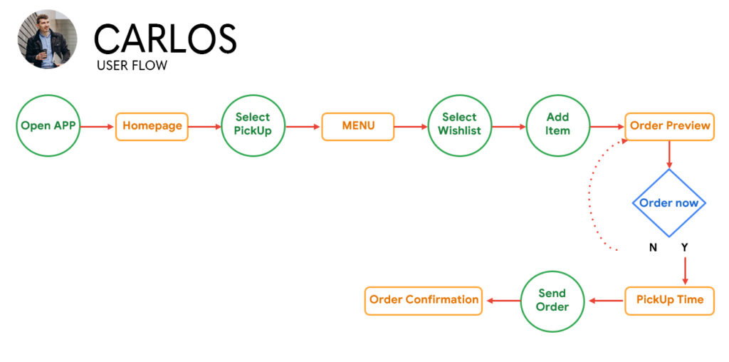
Core user flow
The critical journey connects discovery, selection, and confirmation. The original diagram remains as process evidence, while the interactive block translates the same journey into the portfolio’s visual language.
Ordering journey
-
Start
Step 01 Open the app Begin the journey. -
- Need
- Find a suitable option without losing context.
-
Step 03 Choose a product Review details, quantity, and preferences.
-
Step 04 Review cart Confirm products and subtotal.
-
Step 05 Order ready? Return to edit or continue.
-
Continue Step 06 Pickup or delivery Choose a mode and time.
-
Step 07 Payment Complete the required details.
End
-
Step 08 Order confirmed Show the summary and next step.
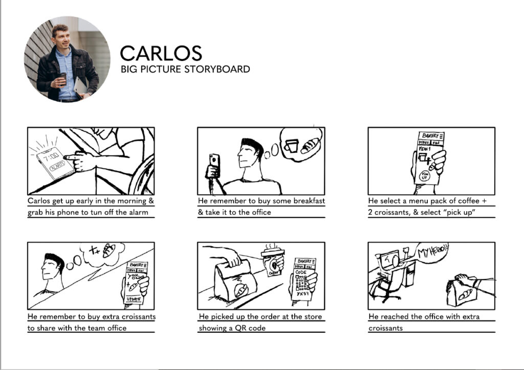
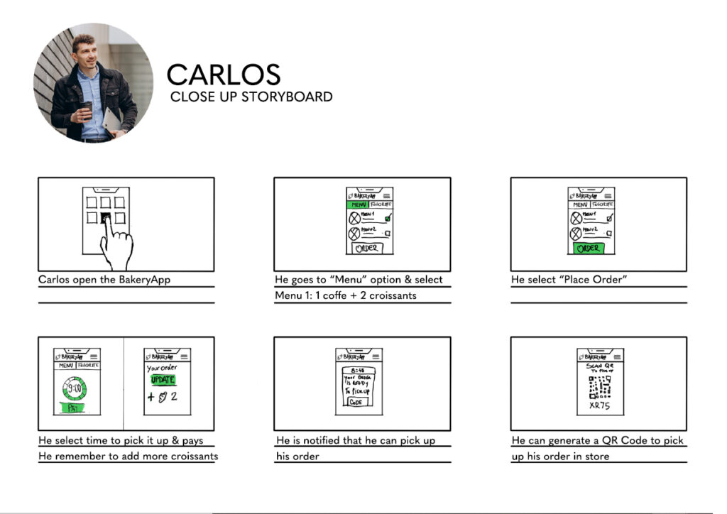
Storyboards: context and interaction
The big-picture storyboard places the product in an everyday situation. The close-up focuses on the moment of use and helps define what a person needs to see and decide at each step.
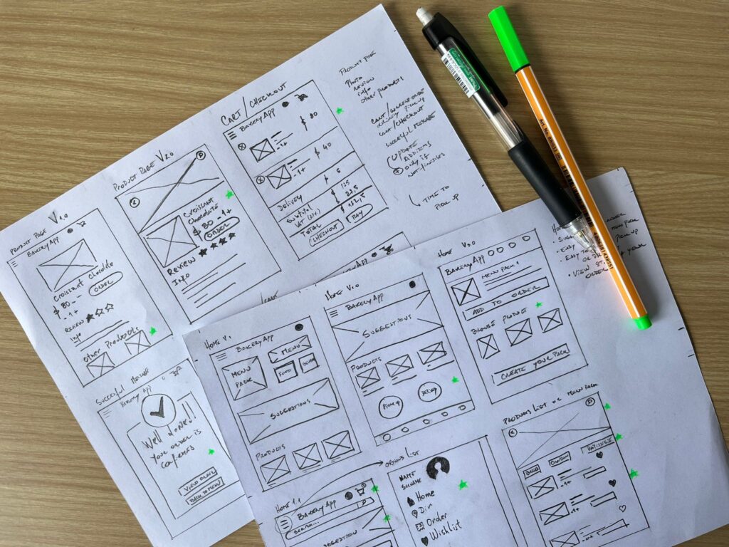
Paper: explore before organizing
Before opening Figma, I drew alternatives for categories, product details, cart, and checkout. These sketches show how I think with my hands: test compositions quickly, compare options, and discard ideas without becoming attached to a screen.
From low fidelity to an early visual direction
The selected alternatives became digital low-fidelity wireframes. I then connected the core journey and tested a first version with content, imagery, and color. The visual result is early and I would approach it differently today, but it honestly documents the evolution of the work.
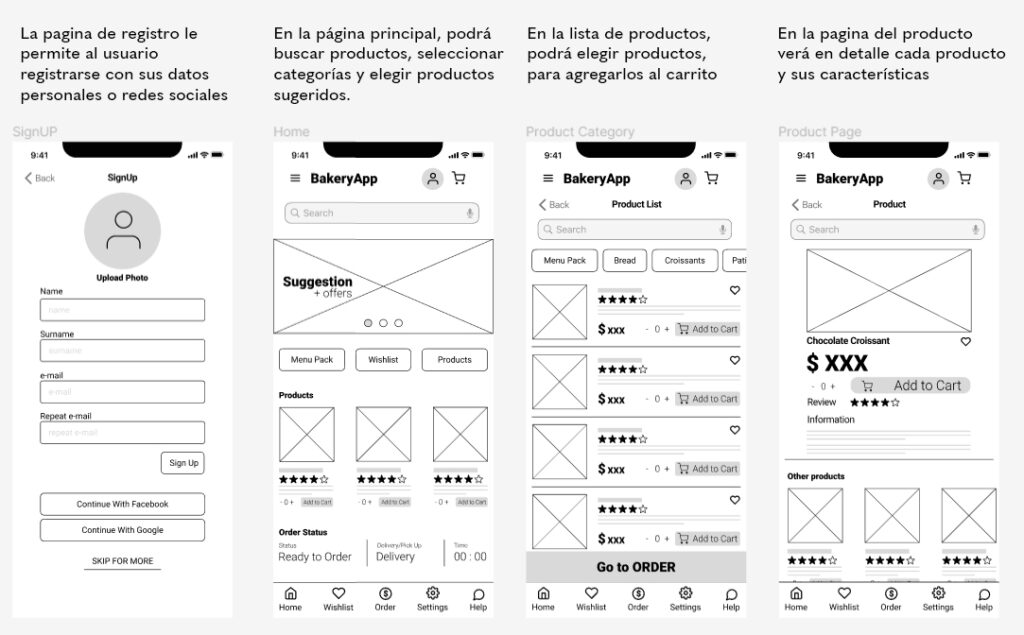
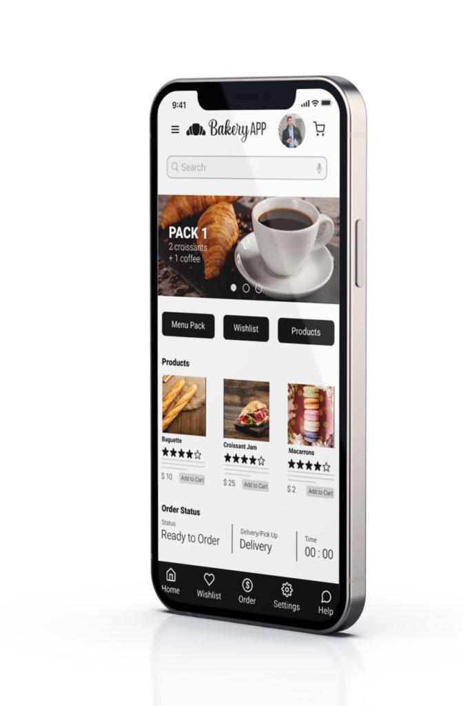
The interface does not represent my current UI level. It remains here because this case is meant to show the complete academic process, from drawing to prototype. A professional visual update and user testing remain the next iteration.
The study protocol was defined, but the validation loop was not completed.
I prepared an unmoderated usability study protocol for five remote participants, with planned sessions of 30 to 45 minutes.
Questions and KPIs
- How long does it take to complete an order?
- Where do errors, uncertainty, or drop-offs occur?
- How easy is the app to navigate?
- Planned KPIs: time on task, drop-off rate, and user error rate.
Study tasks
- Register in the app.
- Find a product and add it to the cart.
- Schedule pickup for 10:30.
- Complete the order and payment.
The plan is documented, but execution, findings, and iteration are not complete. The case therefore makes no claims about measured improvements or validated outcomes.
A useful process still needs a completed test and iteration cycle.
Reflection
Research changed the design, but the loop remained open.
This exercise helped me learn to separate assumptions from evidence and translate interviews into design decisions. It also exposes a clear limitation: a documented process loses value when the prototype, test, and iteration loop is not completed.
Continue the case in Figma, use AI as support, and validate the critical journey.
- Rebuild the mid and high-fidelity experience in Figma.
- Define a clearer visual system, spacing, hierarchy, and reusable components.
- Use AI to explore alternatives, review consistency, test microcopy variants, and document decisions under human judgment.
- Run a real usability study on the complete critical journey.
- Iterate the prototype from observed evidence.
AI will support the work, not stand in for participants or turn untested assumptions into results.